Beyond Prints: Texture Mixing for Outfits With Depth
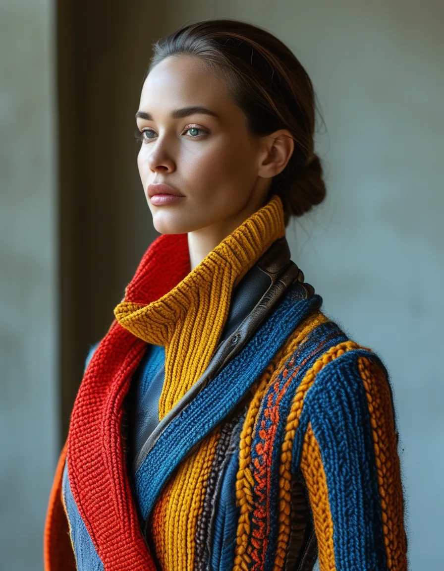
Print mixing gets the tutorials; texture mixing does the quiet professional work — the outfit-depth technique where knit meets leather meets silk and a single-color look turns dimensional. The tactile styling masterclass, no patterns required.
The Contrast Principle
Texture mixing runs on tactile opposition: the soft against the structured (the chunky knit with the leather trouser), the matte against the sheen (crepe with satin), the smooth against the grained (silk with suede). Two textures minimum for depth; the contrast IS the interest a print would have supplied.
The Three-Texture Ceiling
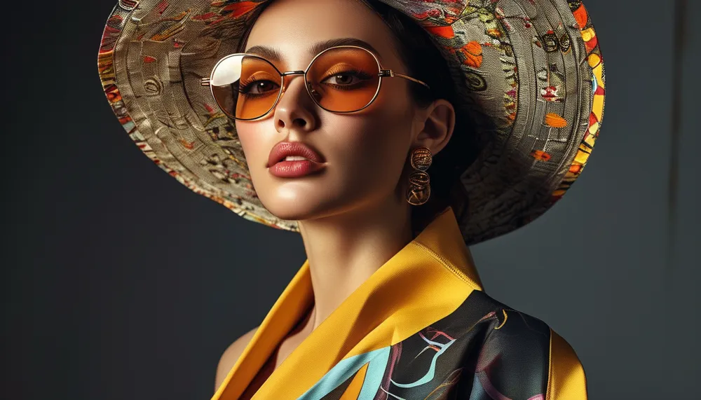
The composition limit: three textures per outfit (knit + leather + silk scarf: rich; five textures: a fabric store incident) — with the proportions weighted (one dominant texture, one contrast, one accent). The print-mixing guardrails translate directly; texture is just pattern you feel.
The Monochrome Masterclass
Texture’s flagship application: the one-color outfit built in three textures (the cream knit, cream trouser, cream silk scarf — the tonal column with dimensional interest) — the technique behind every ‘expensive-looking’ monochrome look on every inspiration feed. Color does the unity; texture does the story.
The Seasonal Rotation
The texture wardrobe by season: summer’s crochet-linen-poplin conversations, autumn’s suede-knit-denim classics, the year-round leather-and-soft axis. The audit habit: outfits reading ‘flat’ in the mirror usually lack a texture contrast, not a color — the fix hangs in a different fabric, same shade.
Oppose the tactile, cap at three, master the monochrome edition. Texture was always the depth dial — the print tutorials just talked louder than the fabrics.
Keep Reading
This article is for general styling and informational purposes only. Trends, sizing, availability and pricing may vary by brand and season.